3 November 2026 · 5 min
Not Having a Say
I read John Gruber’s Prestructured WYSIWYG this morning in WebReader, the article reader I wrote for my Omarchy desktop. Two paragraphs in, I realised he was describing something I have just built.
That something is OmarkyReader and OmarkyWriter, a Markdown reader and a Markdown writer for Omarchy. The reader sets a Markdown file like a page from a well-made book. The writer lets you type plain Markdown and see it styled as you go, then saves exactly what you typed. Neither has a font menu, a stylesheet or an Appearance tab. The structure comes from the file, the typography comes from the app, and the colours come from your Omarchy theme.
WebReader runs on the same principles and the same rendering code. It pulls the article out of a web page, keeps its structure (headings, quotes, links, emphasis) and drops the site’s design. What’s left is set in the same type and the same theme colours as everything else on my screen. Gruber’s article came to me that way.
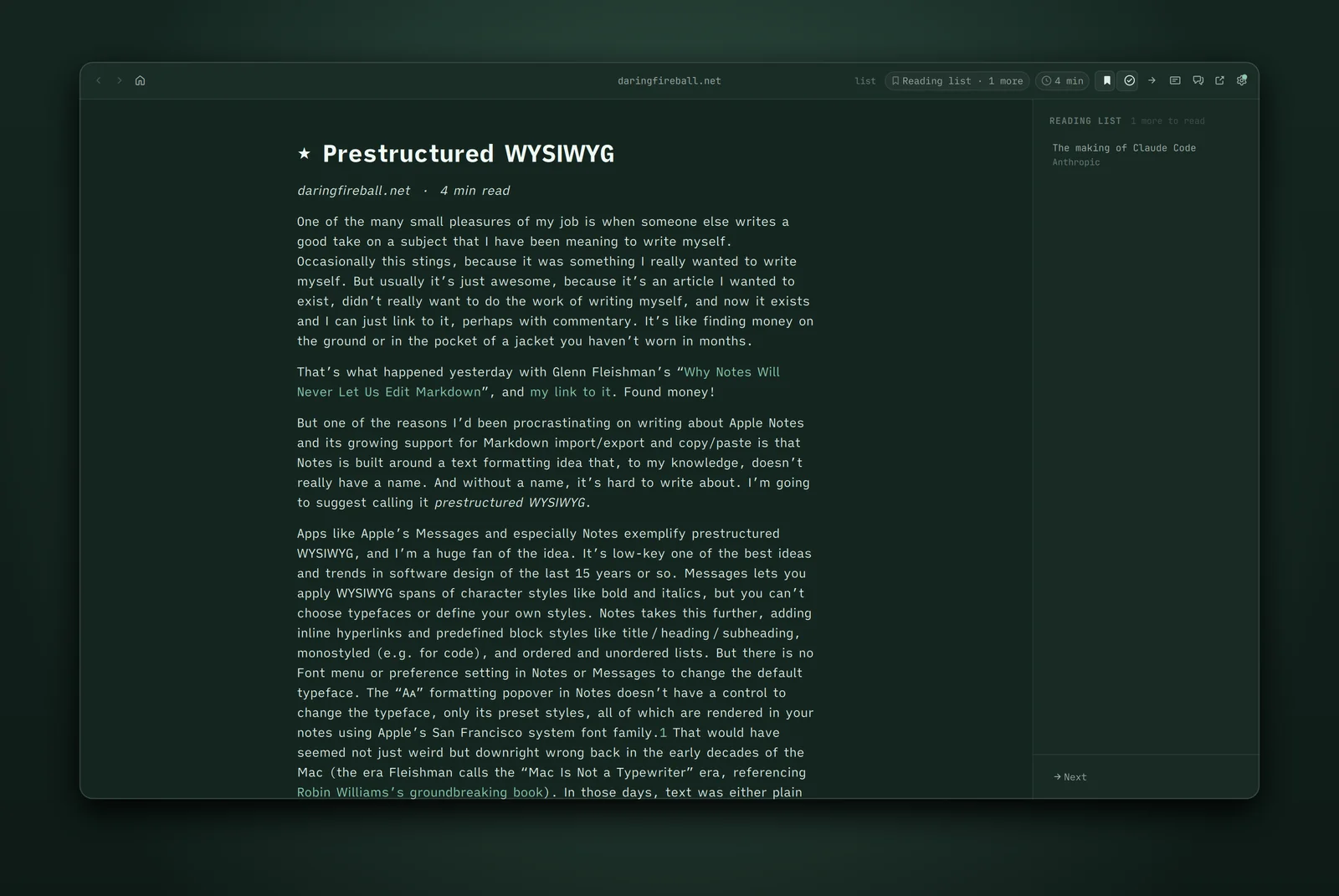
Gruber’s Prestructured WYSIWYG argument goes like this. Apple’s Notes and Messages let you mark text as bold or italic, and Notes adds monospaced text, headings and lists. Neither has a font menu (Notes on the Mac does have the old Fonts panel tucked away, and Gruber’s advice is to pretend it isn’t there). You get San Francisco at the sizes Apple chose, and that’s that. In the early Mac years that would have looked wrong, because rich text meant any font you liked. Gruber’s point is that the old freedom came with two problems. The fonts on my computer aren’t the fonts on yours, and most people with a font menu make terrible choices. Fix the styles in advance and both problems go away. You keep the meaning (this is a heading, this is code, this word matters) and lose the decoration.
The line that stuck with me:
Even if you’re a decent designer (or believe yourself to be), it’s liberating not to have a say in the matter in certain contexts.
He also points out that those preset styles “largely map well to Markdown, which itself has no concern with font choices or specific text sizes.” He’d know. He invented it.
Markdown
Markdown is prestructured WYSIWYG with the WYSIWYG left for later. A # says heading. A pair of asterisks says emphasis. Nothing in the file says how big, which face, or how far from the margin. Something else has to make those decisions, and for most of Markdown’s life that something has been a GitHub stylesheet or whatever preview pane came with your editor.
OmarkyReader and OmarkyWriter are my go at the other half: Markdown set properly, with the decisions already made.
OmarkyReader
Open a Markdown file in OmarkyReader and it’s a page. One centred column about 68 characters wide, the measure of a well-set book. Typography is set by the app for optimised readability. Bullets, numbers and quote marks hang in the left margin, so the text keeps one straight edge.
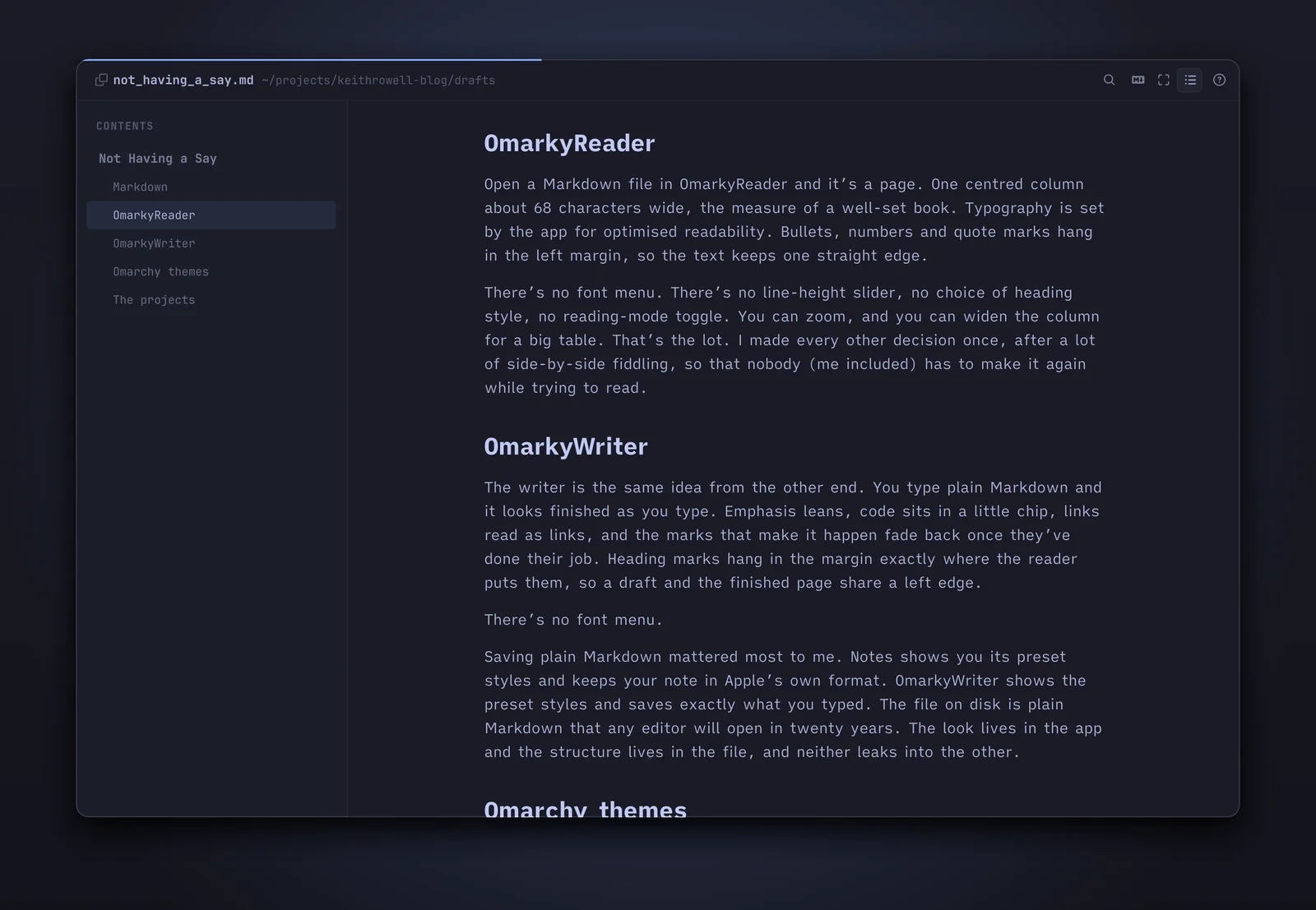
There’s no font menu. There’s no line-height slider, no choice of heading style, no reading-mode toggle. You can zoom, and you can widen the column for a big table. That’s the lot. I made every other decision once, after a lot of side-by-side fiddling, so that nobody (me included) has to make it again while trying to read.
OmarkyWriter
The writer is the same idea from the other end. You type plain Markdown and it looks finished as you type. Emphasis leans, code sits in a little chip, links read as links, and the marks that make it happen fade back once they’ve done their job. Heading marks hang in the margin exactly where the reader puts them, so a draft and the finished page share a left edge.
There’s no font menu.
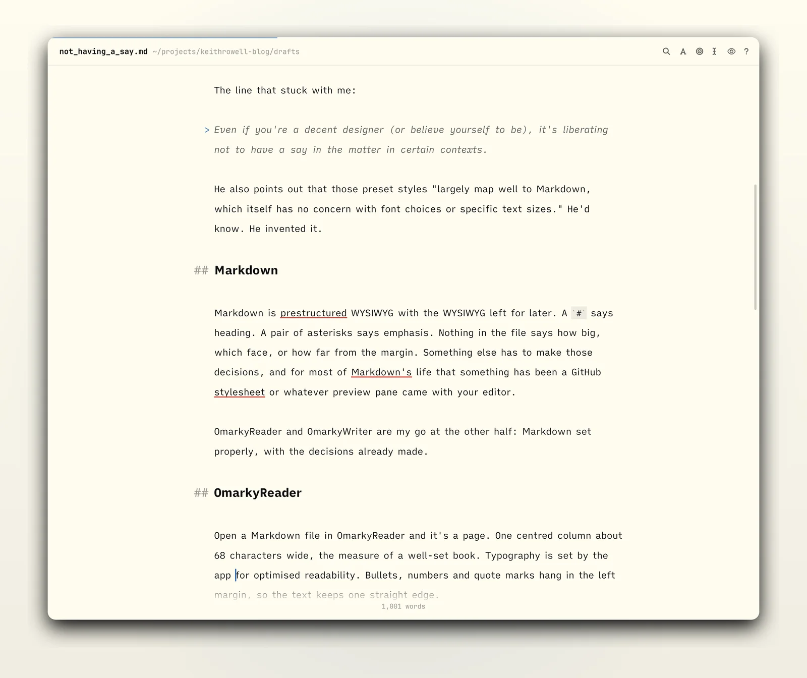
Saving plain Markdown mattered most to me. Notes shows you its preset styles and keeps your note in Apple’s own format. OmarkyWriter shows the preset styles and saves exactly what you typed. The file on disk is plain Markdown that any editor will open in twenty years. The look lives in the app and the structure lives in the file, and neither leaks into the other.
Omarchy themes
Omarchy takes Gruber’s idea one layer further. On a Mac the say belongs to Apple. You get San Francisco because Apple picked San Francisco. On Omarchy the say belongs to you, and you make it once, for the whole desktop.
Pick an Omarchy theme and the terminal, the bar, the window borders and the wallpaper change together. Omarky follows along. The page, the text, the accent and the links take their colours from the current theme, live, the moment you switch, light or dark. Code blocks are highlighted in colours generated from the theme’s own palette, so a block of Ruby matches the page around it. The window chrome uses whatever font you set with omarchy font set, and the reading size follows omarchy display text size.
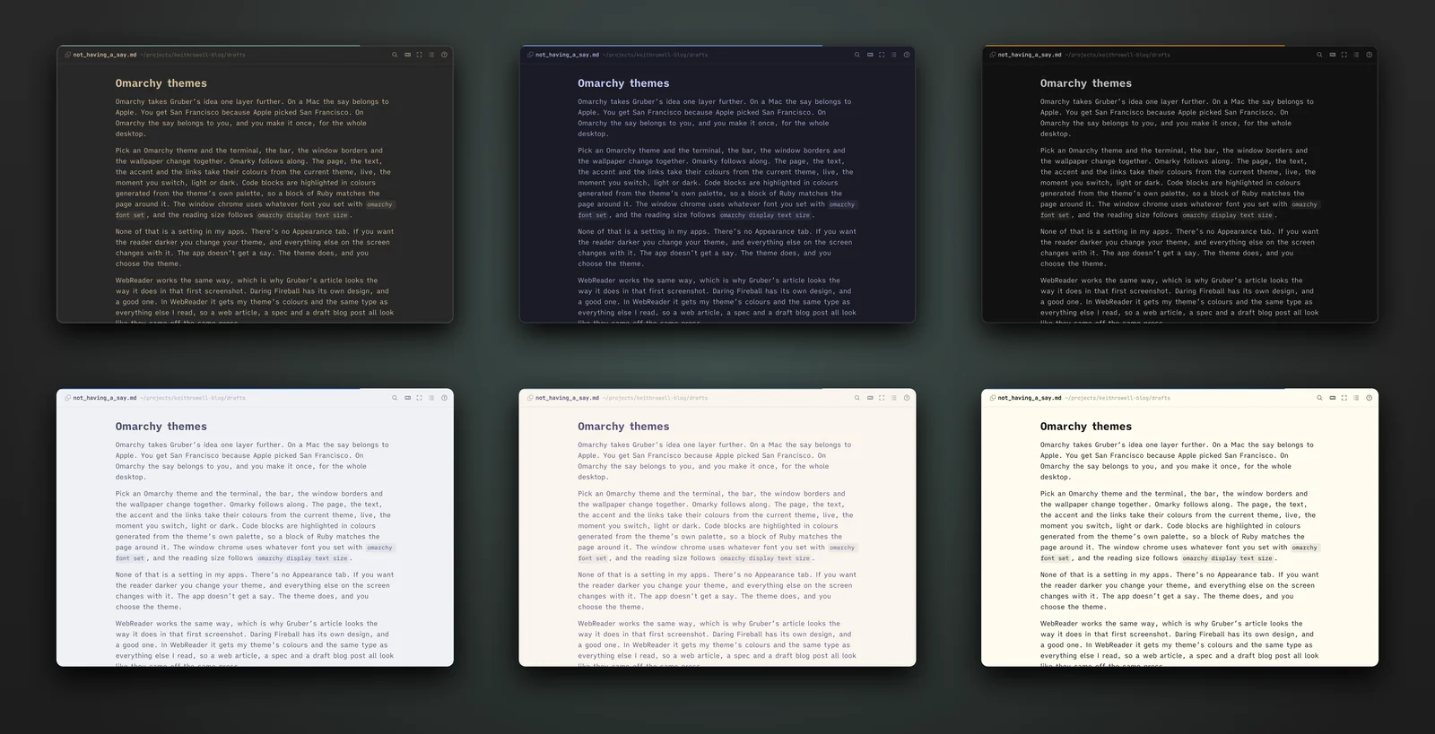
None of that is a setting in my apps. There’s no Appearance tab. If you want the reader darker you change your theme, and everything else on the screen changes with it. The app doesn’t get a say. The theme does, and you choose the theme.
WebReader follows the theme too. Daring Fireball has its own design, and a good one. In WebReader it gets the same treatment as everything else I read, so a web article, a spec and a draft blog post all look like they came off the same press.
The projects
OmarkyReader and OmarkyWriter are open source, under the MIT licence:
- The site, with screenshots and the principles behind the design: the Omarky site
- The code: Omarky on GitHub
I made them with love, and with the experience of the person reading or writing in mind at every step. If you run Omarchy, give them a go. If you’d like to make them better, contributions are welcome.